Widgets and Focus
A Widget is a drawable object inside an App, such as a text button, number selector, or line chart. Apps and Widgets belong to different layers: ViewManager manages Apps, while Widgets are usually App members and share their App’s lifetime.
An interactive button
1 | class ButtonApp final : public IApplication { |
FocusManager belongs to PixelUI. ui.handleInput() first lets FocusManager process LEFT, RIGHT, and SELECT, then passes unconsumed events to the current App.
Focusable state
IWidget defaults to focusable = false. TextButton, IconButton, Label, and NumScroll make themselves focusable; Clock is display-only. Explicitly enable focus when a Brace, Histogram, or CurveChart must participate in navigation:
1 | chart_.setFocusable(true); |
FocusManager navigates only nodes that are focusable, visible, and enabled, and whose ancestors are also visible and enabled.
Widget parent-child tree
The Widget tree uses intrusive parent-child links between caller-owned Widget objects, with no separate node allocation:
1 | class PanelApp final : public IApplication { |
Child coordinates are local to the parent. Children move with the parent. By default, a parent’s bounds clip its children; call setClipChildren(false) to disable clipping.
Widgets are neither copyable nor movable. When a Widget is destroyed or detached from the tree, FocusManager is notified and clears current or active pointers to it.
Built-in Widget reference
| Widget | Purpose | Main configuration |
|---|---|---|
TextButton |
Text button | setCallback, setText, font and text offsets |
IconButton |
XBM icon button | setSource, setCallback |
Label |
Text with directional entrance Animation | setText, setLoadPos, setCallback |
NumScroll |
Integer selection | setRange, setFormatter, setValue, getValue |
Clock |
Analog clock | setHour, setMinute, setSecond, setRadius |
Brace |
Border or container | setDrawContentFunction, addChild, setCallback |
ProgressBar |
Percentage progress bar | setPercent, setPercentImmediate, getPercent |
Histogram |
Bar history chart | StaticChartSeries::add, window and history statistics |
CurveChart |
Line history chart | StaticChartSeries::add, window and history statistics |
BitmapWidget |
Bitmap display | Configure the bitmap and display area |
Callbacks use PixelUI’s fixed-capacity VoidCallback. Stored const char* strings and XBM pointers are non-owning and require backing storage that covers the Widget lifetime.
Widgets that support LoadTransition play their entrance Animation by default. To start directly in the final state, call widget.onLoad(LoadTransition::Immediate). Older names such as TextButton::onLoadNoAnim() and Label::onLoadImmediately() remain as compatibility interfaces, but new code should prefer LoadTransition. Not every Widget provides this overload; ProgressBar, for example, selects Animation behavior through its useAnimation constructor argument.
NumScroll::setValueImmediate() displays a new value synchronously while retaining the fixed-capacity and UI-task constraints.
TextButton and Label
| TextButton | Label |
|---|---|
 |
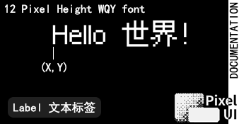 |
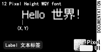
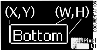
TextButton uses (x, y, width, height) for its rectangle. Label’s POS selects the direction of its entrance Animation.
TextButton can receive a custom font in its constructor, followed by signed textOffsetX and textOffsetY values. When using the default font, pass the two offsets directly after the text argument:
1 | TextButton compactButton{ |
The offsets slightly adjust the final text position. setText(text, offsetX, offsetY) replaces the text and offsets together.
ProgressBar
The built-in ProgressBar is a non-focusable, display-only Widget. Its percentage is always clamped to 0..100:
1 | ProgressBar animated_{ui_, 14, 22, 100, 8, 25}; |
The useAnimation constructor argument defaults to true. In that mode, onLoad() animates from zero to the current target and setPercent() animates from the displayed value to the new value. Passing false makes both operations immediate. Regardless of that setting, setPercentImmediate() cancels this progress bar’s own Animation and displays the new value immediately. If the Animation pool is full, the Widget displays the target value directly instead of remaining at an intermediate value.
NumScroll and Clock
| NumScroll | Clock |
|---|---|
 |
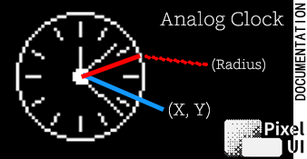 |
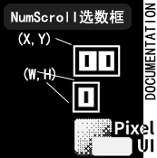
NumScroll coordinates describe the rectangle’s top-left corner. Clock uses center (x, y) and radius. Clock is display-only by default and does not participate in Focus navigation.
Brace
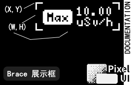
Brace can draw custom content with setDrawContentFunction() or serve as a parent in the Widget tree. Diagram coordinates and dimensions describe its local bounds.
Fixed Chart buffers
Histogram and CurveChart use sample storage provided by the caller:
1 | StaticChartSeries<76> samples_; |
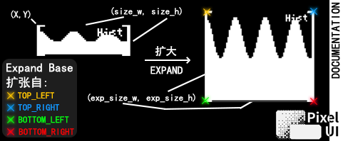
StaticChartSeries owns a fixed-capacity int32_t ring buffer and is passed by non-owning reference. Its capacity must equal the expanded width; a template static_assert verifies this relationship. The series must outlive the Widget, so declare it before the Chart member. Add samples with samples_.add(value).
| Histogram | CurveChart |
|---|---|
 |
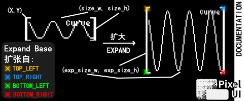 |
Both Charts use the same expansion geometry: EXPAND_BASE selects the fixed corner, and ChartExpandSize<W, H> sets expanded width and height. Histogram draws bars; CurveChart draws a continuous line.